From the EQ2 Forums:
Krono is live in EQ2! Buy, trade, sell 30 days of Gold Membership time! To Buy or Use Krono in game, open your Character’s Equipment panel (“C” is the hotkey) and find the Krono interface at the bottom. For more detail, see http://tinyurl.com/eq2krono.
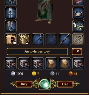
The near universal reaction from players to the addition of Krono to the Character/Persona window has been that the UI elements are far too obtrusive.


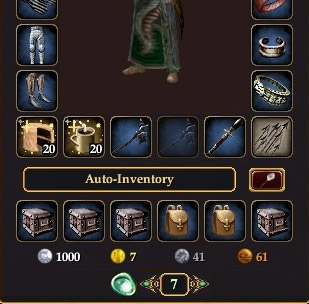
| Left: The new Persona window with large Krono “Buy” and “Use” buttons at the bottom. | Right: My mockup for a more subdued Krono interface.
Clicking the left arrow would show the BUY screen. Clicking the right arrow would show a window explaining how Krono can be traded, and asking if you want to redeem a Krono for a 30-day Subscription extension. |
Krono going live today and the interface for the krono in my character screen is hideous, obtrusive, ugly, and downright rude! This shove it in my face advertising PISSES me off like nothing else. you want marketplace fine, you want krono item fine, But leave it in the marketplace and stop shoving it in my face and cluttering up my UI with things that I don’t need want or use. The krono item itself is a good idea but the in your face gotta see it every time you look at your character screaming BUY ME BUY ME BUY ME interface SUCKS! I would be very delighted to have the opportunity to know who’s brilliant friggin idea that was and shove it directly up their backside sideways.
Now would you like to know how I really feel?
/endrant
Avianna, moved your comment here and added a mockup of how the window could look with Krono a bit less overstated. 🙂
Does this show up for gold subscribers? I’m guessing yes.
Why?
I already pay monthly. I don’t need this. Hit up the free players…
It’s hardly a big enough slice of the EQ2 population to decide that everyone hates it.. I couldn’t give a rat’s which size the KJrono is. I’m an advocate of the Kronos usefulness being expanded to all areas, and services, and wouldn’t even mind if it was permanently on the experience bar, like next to the SC button, flashing. If it gets more people to buy it, and that gets more money to EQ2, and that stops them pulling the plug on the game for an extra 6 months, I’m good.
So you would be ok with banner ads in-game?
thanks for moving it to a more appropriate post Feldon.
the krono itself is a great idea, love it! but the implementation of it takes away any thought of usefulness, or good about it. I have modded my UI to look and feel how I want it, I even have a custom “flaming Pheonix” background I modded in. I will check the coding and do whatever I can to eleminate this intrusion to my character window. But in doing so I will lose the ability to either buy or use the krono too. But that is completely worth it to me to get this off my char window. It belongs in the marketplace right next to the other cash-only items such as the keyfob.
Well I question them because of the price. So I get a 6 month sub fox x number of dollars, Well the krono is more than a regular month’s sub. So why would you buy one unless you wanted to sell it to another player. I just don’t get it.
Indeed, marketplace. I have my credit card on file for renewed billing because I do not want to be hassled about my subscription.
Ok, I tried to hold my tongue, but it just isn’t going to happen. I’ve played this game since it first came out. I’ve adjusted my play style for a lot of things. Wardens were nerfed, un-nerfed, nerfed again; UI’s got changed several times over; new buttons were added to the screen; different keyboard buttons were implemented to open inventory (that one took me months to get used to and i still sometimes hit I); but I’m sorry, this is just too much!
I must say, I partially agree with Avianna, if they had added a new button on the bottom of the screen next to the SC button, that would have been acceptable (just not flashing all the time). The character window is opened several times a day when playing the game and to have something like that on there is simply offensive. Not to mention the people that might accidentally click one of the buttons to buy or use. I know I’ve mis-clicked several things in my day (thank god for confirmation before destroying something).
It almost reminds me of the turbine button in lotro its big and ugly. I just hope that drums ui mods it out.
You can bet that if a Mod doesn’t get rid of it then this mod has gotten rid of me.
does this seem like a “phase 1” type of deal to anyone else, it worries me, that they are going through all this hype over a useless item, unless…. SC cards are phased out “phase 2” i hope it’s a paranoid moment, because a price hike for an aging game, no matter my fondness of it, will likely kill it
I have to thank the drums UI folks no krono for me in my character window. Now them sj needs to add it to the store in case I want it.
drums UI FTW. No chrono button. this game looks like it is going P2W. first the market place, then free to play, now pay to win ($ for Plat).
As others have said before, this definitely belongs only in the SC Marketplace. Having it on the character screen where vital game stats are displayed makes it look like one of those cheapy cell phone games where you can purchase “Energy” to advance in the game.
Oh well, I’m sure DarqUI will have a mod to not display it.
I don’t think that is what is going on with the Krono. I think this is their response to all of the people that want to be able to buy sub time with SC in game. Yes, you can still use SC game cards for sub time through the website, but you can’t use SC you have already added to your account. Plus, for people that are hesitant to hand over a fistful of plat for a game card code that could possibly be useless, the Krono assures a safe plat-for-subtime trade. The extra cost is the penalty one pays for convenience and assurance that the Krono will be legit.
I will continue my recurring sub paid with my cc, but it’s nice to know that there is an additional option, should I ever wish to make use of it.
They won’t get rid of SC cards. HTey have a whole marketplace packed full of useles items you can buy there with it .:) The Krono is a stage 1 for sure. If people really like using it for subs and it goes over well, maybe they will use them for Expansions next. 🙂 I can hope there. I don’t want the krono on my char scren for sure, but drums does not have it so it is a moot point. I would not mind having a separate tab for stuff like though so I can go there if I ever need it. 🙂
Least for me, it doesnt show up at all on Drums, assuming its cause the new ‘feature’ hasnt been added to the persona window in it. Not that it’s really needed anyways =P
And just to add, that you can always just loadui the default to manage Kronos without having to see them when normally playing.
I like your smaller rendition of the button Feldon.
The Krono button did not show up in Profit so I had to switch to Beta to see what the screaming was about. Yeah, it’s too big. Adding it next to the SC button on the default ui bar would disturb the balance of that bar.
They could place it on the Options page of the character screen. After all, it is an optional purchase, yes?
@Badcat: The Krono’s have been in the marketplace since the servers came up today. They’re under Membership.
@The Secret World: Look at Planetside 1. You won’t find even 10 players online anymore most of the day (everyone moved on to the PS2 beta), but they are still keeping the server running. Really no need to worry about SOE pulling the plug in any game that has been live for a while. They stop development at some point, they’ll keep merging servers until there is only one left, but they don’t pull the plug.
So hang on 1 Krono costs $10.99 and can be used for 30 days playtime. 1 month sub costs $14.99. WTF?
I guess I was not being sarcastic enought sorry. NO I am very glad that my drums UI did not change and I don’t have to look at the krono. I logged in for a short while and folks did complain about it some.
I will be more than happy to fund the game via my cc whit 6 month subs, I don’t need the krono, not yet anyways. Now I will have a problem if that is the only way to get a sub.
Like the one guy said, I pay monthly and have no intention of ever using this, why must I even look at it.
agreeing with others. i’d rather see this as just something on the marketplace instead of in my inventory window. I use a six month payment, i dont need these things to even show up for me.
@Flourchild
You can change what keys are bound you know. I instantly changed my inventory button back to I from the stupid C they set it to when that change happened. UI changes dont really bother me most times but i will say this new krono thing needs to be taken off the inventory window, it’s annoying looking.
Might be a sale thing to get them noticed. At Fan Faire they were advertised as costing $17.99.
Krono belongs to the marketplace not in the char window.
Feldon, how about racing style armor? I seem to remember a pic a few years ago that had an EQ char dressed up NASCAR style with sponsors all over. 🙂
Why not put it on the currency tab? – It’s a kind of currency afterall