You might have heard that EQ2’s User Interface is getting some spit and polish. With today’s Game Update 57, the default User Interface (UI) for EQ2 is getting some subtle and some not so subtle tweaks.
Major additions include the introduction of an “EQ2 Dock” to replace the existing EQ2 “start” button and XP bars. Also, the Character, Inventory, and Options have been merged into a single Character superwindow accessible by pressing “C” (Crouch has moved to “Z”). Bags have been streamlined, the Welcome window has received a facelift, the Map window now shows some key update locations (not to replace EQ2Maps), and
Many players do use some or all of the default UI, so there has been concern that the default UI has shifted from a predominant blue hue to a red one. You’ll be happy to know that the default UI includes a Blue graphics set which can be activated in-game by typing /loadui.
As always, players have the choice of installing other UIs. Which is why Rothgar, Lead Programmer on EQ2, notified the EQ2 interface community just over one month ago. The UI Revamp does not add popular Click-to-Cure, Autoattack Status, or the Advanced Broker available either separately or in packages from UI developers. You’ll want to visit EQ2Interface.com to see what’s going on with your favorite modifications.
>> ProfitUI Fix for Game Update 57 <<
Note: There seems to be an obscure bug with the Blue EQ2 theme. Guild level is being reported significantly lower than it should be in some situations.
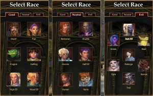
Game Update 57’s changes start right from Character Creation, as you can see below:
Race Selection
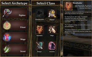
Class Selection
Players start by selecting an archetype, then their specific class. Game Update 57 has changed which classes are good-only, evil-only, or playable in all cities (neutral).
SOGA Default Appearance
A surprising change in GU57 is that going forward, the SOGA or “Alternate Appearance” is being swapped in as the Default Appearance. Players reaching the Character Select screen for the first time will now be greeted with the Asian-influenced SOGA models instead, for those races that differ between SOGA and Original.
We have not heard any hint thus far that the original EQ2 character models are in any danger of being removed or will somehow not be supported going forward. However there is no doubt that there will be thousands of players angry upon first login to see that all of their characters and friends characters have changed in appearance.
Fortunately, this is easily resolved by re-activating the original EQ2 character models under “Alternate Appearance” in your Options window.
New EQ2 “Dock”
Shown in both full and collapsed modes.
You have read some news about the new EQ2 Dock already here on EQ2Wire. Specifically the StationCash button being added to the right-hand side of the toolbar. It seems unnecessary to us to add this button, and no doubt third party developers will find ways to remove this button without losing the other features of the new toolbar.
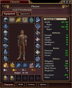
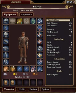
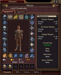
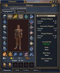
Character/Persona/Inventory
You’ll notice that Appearance slots are now available from level 1, and that the display of stats has been merged with the Persona window.
As you can see, it’s quite easy to get the new UI in the traditional blue if that is what you prefer.
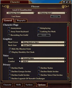
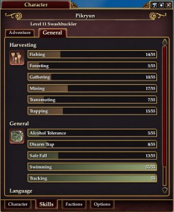
Options, Factions, both Tradeskills and Adventure Skills, Biography, etc. are all accessed from within the new Character superwindow.
Bags & Maps
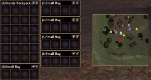
Bags have been streamlined to be less visually ornate and more space efficient. As you can see, there are more points of interest on maps, even without the installation of EQ2Maps.
New Player Tutorial
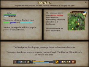
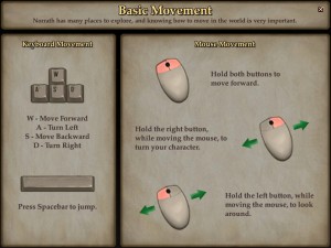
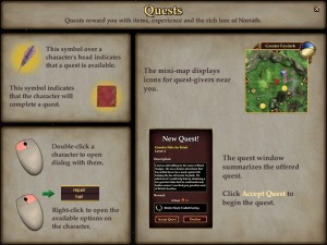
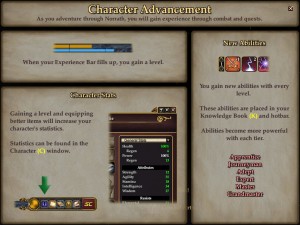
The EQ2 Team have really pulled out all the stops to try to provide a smooth experience for new players as far as revamping content in Darklight Wood and the Greater Faydark Nursery. These changes are also evident in Rothgar‘s new detailed, pictorial tutorial for new players. In place of some of the wordy popup tooltips that assailed new players are these high resolution tutorial screens.
Welcome Screen
and finally the Welcome Screen, which has received a pretty big revamp (although I think it could still use some work).
Will There Always Be Blue?
From Rothgar:
We are shipping some alternate textures under the skin name “Default_Blue”. You can use the /loadui command to try them out. The shade of blue is almost identical to the existing UI on live.
The Default_Blue folder will be patched down and maintained by the patcher. You won’t need to download or install anything separately.
At some point we may look into adding a “Theme” dropdown in the Options window to make it easier to switch between UI skins, but this wasn’t something we were able to work in prior to GU57.
Conclusion
Again, there are numerous nips, tucks, and tweaks throughout the EQ2 User Interface, including a rebuilt StationCash Marketplace window with a Preview panel. Some in-game market windows now display a handful of StationCash items as well, which has elicited angry responses from players.
EQ2Wire personally believes that for $15 a month, I should be able to avoid in-game advertising. I know right where the StationCash button is, and can access it any time I like. I don’t need the constant reminder.
I appreciate the efforts of Rothgar who has always taken a keen interest in making sure that, along with everything else, the EQ2 Interface is easy to use and easy to customize. However we cannot condone the changes which seem to have been necessitated by the introduction of EQ2 Extended (F2P).
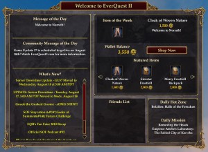
And yet they still show the TSO hotzones / DD instead of showing something relevant. Pah! (I believe that change is coming with the next GU?)
The only plus side I see to this is they might actually keep the ‘Whats New’ updated with downtimes… you should never have to check a webpage to see whether there’s any down time due… you should be notified in game.
A real shame they couldn’t add some REALLY useful things to the UI like click-to-cure.. maybe they’ll get there one day.
Hot Zones and more Smart Loot are supposed to be coming in a future update.
I think it’s funny that the character creation icons still show pictures of the old models, but the default is Soga. Someone not knowing will click that button and go…”why doesn’t my character look like the picture?”.
Rounded edges seems the major thing here. Just awesome…
Strange still no click to cure functionality.
Group and raid windows are untouched ? (using Darqui)
thanks for the pics.
made be me feel a bit better seeing the changes.
that said i wish they could have released them to the press a bit earlier so we’d not have spend 2-3 weeks praying they wouldn’t screw it up (social impediment of mmo gamers i think, stung to many times).
as for soga being the new default, as long as the swap back is easy i dont mind to much, but i have friends that prefer them so tastes differ.
Mentat,
Sorry, I had the screen shots 3 weeks ago from Test but in the process of moving and getting ready for Fan Faire, it slipped. So sorry for the angst.
Loaded “Default Blue”, all my hotbars disappeared. They stay gone even if I switch back. Anyone know how to enable them again?