
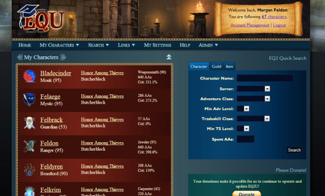
Stylin’ with EQ2U – Help Test the New Look!
Over the last year and a half that EQ2U has been in operation, we’ve always kept the functionality and usability of EQ2U at the forefront. However the look-and-feel of EQ2U has been gotten a bit long in the tooth. After seeing Google’s disastrous revamp of Gmail, and Apple’s controversial flattening of iOS7, we’ve thought “Let’s not go drastic, let’s not remove functionality, and let’s not change things for the sake of changing things!”
With those thoughts in mind, I’m happy to unveil the new style for EQ2U. We are opening up the EQ2U Dev (beta) site to the public so that you can check out the new look-and-feel. I hope you will find it instantly familiar, but improved across-the-board.
IMPORTANT! Please report any bugs or issues you find, as well as any feedback you have about the new site at our Contact Form!
NOTE: If you have an EQ2U account, just login again on the Dev site and you’ll see all your characters.
Trackback from your site.
Comments (34)
Gash
| #
Yup, I hate change just for the sake of changing things. iOS7 is a perfect example.
That being said, how is that not what this is? The article only says the look-and-feel was getting long in the tooth (which is change for the sake of change!)
I mean I appreciate the site, I’m just curious if there are any practical reasons for the changes.
Reply
Feldon
| #
First, thank you for the feedback.
The practical reason for this new EQ2U style is, I have always considered EQ2’s primary colors on a tan (originally white) background to be “placeholder” graphics, awaiting the day I could develop a cohesive, professional theme to upgrade the site to. Even though I am a graphic designer, I’ve been increasingly interested in PHP/MySQL scripting, so whenever I’ve sat down to work on EQ2U, I’ve ended up working on new features rather than tweaking the overall design. But, looking ahead to Quests, Recipes, Collections (shinies), and the Treasure data, I’ve spent unproductive hours building mockups of what these new pages should look like, and in all cases, the current theme has been holding me back. We need a design language to build out the future of EQ2U and we haven’t had one.
I’m not averse to offering selectable color options, or making changes to the new design. But I would like people to know that Dethdlr and I agonize over the look-and-feel and functionality of EQ2U. We’ve had multi-hour discussions over navigation, or whether a page should have tabs or some other design, or what the name of a button should be. It took us over 20 hours of discussion to agree upon the current Experimentation/Refining view.
Before I do anything on EQ2U, I think about: How will this be used? How will it look? How will people find this feature/button?
Also, I’d like to clarify my issues about Gmail and iOS 7…
Change is just part of life. The reasons why I can’t stand the Gmail revamp are because it fails on a functional level. As an e-mail client, it is now functionallty weaker than it was. Most of the navigation and everyday features are now hidden behind countless [+] menus. In the design world, this is called Mystery Meat Navigation and is frowned upon. Four to eight clicks are now required to do things that used to take one. The Gmail Compose UI can be summarized by this:
As for iOS 7, I’m not dead-set against “flattening”. However by going to a completely flat theme, they’ve thrown out the context in the process. When you look at the Clock, the Notes app, the Compass, the Games Center, etc., everything looks and feels the same, which means it’s not immediately intuitive which app you are in. In iOS 6, while the visual metaphors (skeumorphism) were a bit tired-looking, they immediately informed the user as to where you were. They gave the user context.
Reply
Jrel
| #
In the gear report, I would like to be able to sort characters I add by the STA rating (or preferably whatever stat I choose).
Reply
Feldon
| #
Believe it or not, this is a technical limitation of the Javascript table sorter script I am using. If I set that “Total STA” column to be sortable, everything goes crazy. 🙁
Reply
Jrel
| #
I also like the original sandstone background, not the new dark green one.
Reply
Maikeruu
| #
I prefer the current more plain and easier to read at a glance arrangement. However, adding the new skin as an option for others and possibly opening up additional color and style changes might be the best compromise. Not having choices when a change is implemented is what makes things like the X-Box dashboard such a pain.
Reply
Flourchild
| #
I can’t believe how rude and inconsiderate you people are. Feldon has been doing this site for years, with very little help from SOE, very little help from anyone really, and all you can do is complain about how you don’t like change when he tries to make things better. Didn’t anyone ever teach you “if you don’t have something nice to say, don’t say anything at all”? I love the new features and colors of the site. It looks very professional. Thanks Feldon, for everything you do for us gamers to make our lives easier. 😀
Reply
Charn
| #
Really? Feldon put this up here and specifically asked for feedback. Yet when people give that, and in no way rude or demeaning, some even giving constructive feedback (like giving us a choice of backgrounds, though that may mean twice as much work and may not be feasible) you jump all over them as if their comments were derisive and derogatory. Why? Because you like the new look?
People are either going to like something or they’re not. Just because they do, or don’t, and tell you so when asked to doesn’t mean they’re rude, nor is any opinion wrong. It just is. I don’t think (in my opinion) it is constructive to call someone rude when asked to give their opinion . . . and they give it. And in no way does it mean Feldon, Dethdlr, or anyone else that may work on this site is unappreciated.
That being said, I like the darker colors. It’s easier on my eyes, though I can see some people having problems with the lack of contrast and darker background. I’m always a fan of choice. If it IS feasible to give us a choice of backgrounds, more choices is always better (imho).
Reply
Feldon
| #
I did ask for feedback, and interestingly, this page is the first negative feedback I’ve gotten from anyone I’ve shown the new site to. Thats fine, and as long as it’s not a personal attack, I want to read it. I’d rather know what people think than just guess (and probably guess wrong).
I’ve already gotten a half dozen e-mails requesting changes and I agree with most of those that I’ve gotten and will get those changes in soon.
I have to say I’m not too excited about the idea of maintaining the current theme exactly as it appears on EQ2U, as I have made some pretty substantial changes to the code on the Home and Item Search Result pages. I’ll be reading feedback this week before I make any decisions about alternate color themes.
Reply
Dethdlr
| #
He’s had more than “very little help” from someone. Just ask him. 🙂
Reply
Feldon
| #
EQ2U exists because of two people who have equal input into the site’s design and features: Myself, and Dethdlr.
When we started, Dethdlr built all the architecture and handled all the data structures, while I focused on the visual layout and views. Over time, our workflows have meshed (and I’ve smartened myself up a bit about PHP/MySQL), and sometimes we collaborate in different ways, but ultimately, EQ2U is a two-person job.
And as for SOE, everything you see on EQ2U is directly a result of input and collaboration with SOE. Dethdlr exchanged over 1,000 e-mails with SOE in the 3 months leading up to our launch. Our site would not exist without close collaboration with SOE and I could not be happier with our communication with them. I do wish the Layoffs hadn’t happened, as that put a crimp in our data timetable, but I’m still optimistic.
Reply
badcat
| #
OK I do have a question. I have several of my characters showing 620 AA? It is doing it on live as well. I was wondering what is up with that. Is that due to having multiple AA profiles set up. Just wondering.
Reply
Feldon
| #
This is because we get 2 data points from SOE — availablepoints and spentpoints. Availablepoints and Spentpoints can now both be 320, giving a number of 640.
It’s actually kind of a complex issue because you can “spend” 320 AA points even if you only have 247. We almost need a new data field. We’re in communication with SOE.
Reply
badcat
| #
That is what I thought it was, thanks for the reply. Oh and Feldon most of us do very much appreciate all the things you do for us. Just wanted to say that.
Oh and you little picture of how gmail works spot on. I been using gmail since the very first beta back in 2004 there abouts. The keep messing with it and it drives my smart phone nuts, everything keeps piling in important despite me moving it to other tabs lol.
Reply
Zeddy
| #
Change is inevitable, it’s a law of nature and a fact of life. I liked the old scheme, but I also like the new scheme. Nice job, keep up the good work.
Reply
Feldon
| #
The irony is, I hate change for change’s sake. The rearranging of the control panels from Windows XP to Windows Vista. There was no rhyme or reason, no purpose, no benefit. It was just job security by someone at Microsoft. I will never rearrange things on EQ2U just for the sake of doing it. 😉
Reply
Gash
| #
Change IS a normal part of things. But it should only come when there are improvements to be made. Like Feldon, I hate change for its own sake. When change can make things function better, then I’m all for it
Reply
Caela
| #
In the Gear Report – the search box is a light tan color with white writing – can barely read the white on tan.
And of course, I appreciate all that you and Dethdlr do – especially when you put in features I requested 🙂
I like the new look – it looks more polished.
Reply
Feldon
| #
Yeah Gear Report needs a bit of surgery.
Reply
Bob
| #
Could you add a link under the Wire Network drop down that links,over to EQN Wire? The reverse is on EQNwire and is a touch handier to navigate between the two sites.
Reply
Feldon
| #
I wish I could find someone to help write EQNWire…
Reply
Dedith
| #
I vote Chuina! I mean he’s only playing planetside 2 between EverCast episodes! 😈
Reply
twisty
| #
One thing that I find frustratingly missing is ability to combine Item Search with “recently discovered” category. For example, all “recently-discovered, Fabled-only”. This would cut down after-patch researches to seconds from 20mins.
The ItemSearch and Recent-Items sections don’t need to exist separately either as a result. Or if you want to still keep it, Recent-Items link can simply pipe thru an ItemSearch query.
Reply
Gash
| #
this would be a great feature!
Reply
Feldon
| #
Recent Items and Item Search Results definitely share a lot of display code, but they’re still different. We know people want to be able to sort or limit by Level and Tier (Fabled, etc.) to sort out nuisance items. It’s something we can certainly look into (classic SOE Live answer I know).
Reply
Charn
| #
So . . . the student has become the master . . . . impressive. MOST impressive.
Reply
Gash
| #
Another thing I’d really like to see is on the Achievements tab: being able to see the most recently earned Achievements for pople. (like you can in-game for yourself)
I’m not sure if the soe data feed allows for this info though.
Reply
Feldon
| #
I could probably do a “Last 50 Achievements” for a character. We really need a place for people to Vote for this stuff. If only 5 people want it, is it worth the effort? 😉
Reply
Quabi
| #
The drop down menu for “My Characters” says that the group is empty, but it’s not.
Also, the ads seem more annoying with the new style. Maybe it’s just because the rest of the site is so much nicer looking.
Reply
Feldon
| #
UPDATE: I think I got the Empty Character Group bug fixed.
Reply
Quabi
| #
Yup, that was fast
Reply
Wurm
| #
I like the old colors personally, BUT that being said you could make it black with white comic sans ms text and I’d still use it.
EQ2U is just that good.
Reply
Abatha
| #
Personally you have more information than I already use. As long as you’re not putting dark blue text on black pages (or something similar) I’m pretty happy.
That being said I suppose I should check out the functionality of the new pages and see if I have any constructive advice to offer.
Thanx Feldon and Dethdlr for all your hard work.
Reply
Feldon
| #
Just wait til we have quests, recipes, and shinies. 😉
Reply